Give Each Panel One Clear Task
Start with the information a visitor needs to find: an introduction, stream schedule, community rules or a contact route. Choose a short label that names that task. A panel image is a heading, not a suitable place for the complete explanation. Write the description separately so dates, links and instructions can be maintained without regenerating every image in the set.
List the planned panels before creating them and remove repeated purposes. A schedule and a general introduction need different information even when their artwork matches. Keep labels understandable without knowing a private joke or guessing an icon's meaning. Review the actual linked destination separately. Designing a panel does not create the destination, check its permissions or guarantee that a viewer can complete the task after clicking.
Use the Maker's Actual Canvas Size
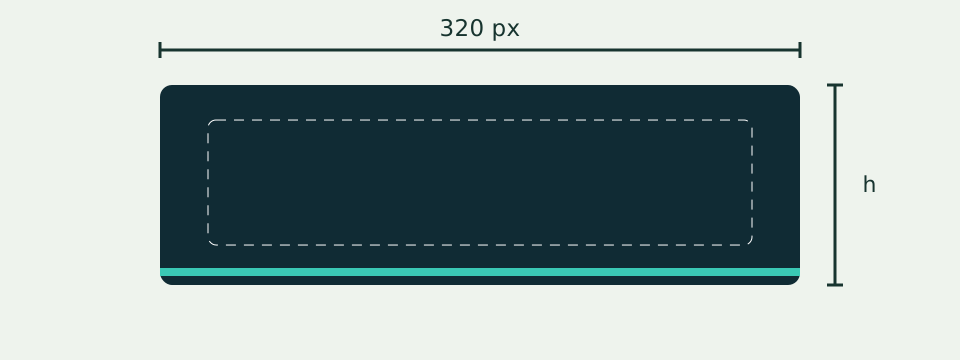
Savvy Toolkit makes a 320-pixel-wide PNG with a selectable integer height from 64 to 300 pixels; the default height is 100. These are this maker's bounds. They are not a promise about every current Twitch upload rule. Check the platform's current help and upload interface before publication, especially when repurposing an image made elsewhere. The maker does not upload to Twitch or edit a channel account.
Choose a common height for the set unless a particular purpose requires a different one. A 320 × 100 image contains 32,000 pixels, while 320 × 200 contains 64,000. That doubles pixel area, not necessarily the encoded file size or readability of a one-line title. Increasing height does not add a second line or wider text area in this maker. Judge the spacing and label together rather than choosing the tallest allowed canvas automatically.
Fit a Short Title Instead of a Paragraph
The title accepts up to 48 Unicode code points after trimming and text normalization. Newlines and control characters are rejected. A length limit does not guarantee visual fit: wide letters and different scripts can occupy different widths. The maker measures a bold title and reduces its font size within its available range; text that still exceeds the area prevents a ready export. Do not keep adding words simply because a counter has room.
A short title can still become crowded after localization. Compare the actual rendered label in each language, preserving accents rather than replacing native spelling just to save a few characters. Move longer explanations into the channel description. There is no editable multiline paragraph, custom font selector or automatic language translation in this tool. Reword the label deliberately and recheck its fit instead of treating a smaller font as a solution to every long phrase.
Use Alignment and Space Consistently
The title has a 272-pixel fitting area within the 320-pixel canvas, leaving 24 pixels on each side. Left, centered and right alignment are available. The accent stripe occupies the bottom four pixels, while the title is centered vertically within the remaining area. At a 100-pixel height, that remaining area is 96 pixels and its midpoint is 48. These are layout coordinates, not an instruction to put text on the accent stripe.
Choose one alignment for related panels unless a clear content reason requires another. Compare the left and right edges of the complete set, not just one image at a time. A long centered title and a short left-aligned title can create inconsistent visual rhythm. Do not invent extra text rows or crop margins out of the downloaded file to force a match; update the title, alignment and height in the maker and export again.
Separate Flat Color Contrast from Artwork
The solid theme displays a contrast ratio for foreground against the selected background. It is a calculation for those two colors, not an accessibility certificate for the channel. Black against white gives 21:1; identical colors give 1:1. These examples help check what the ratio means, but the actual title size, image use and surrounding page still need review. A high number cannot repair unreadable wording or missing descriptive text.
Bands and artwork introduce more than one background under the title, so the single solid-color ratio is not presented as their final rendered contrast. Inspect the actual words over their lightest and darkest areas. The artwork theme uses the supplied original abstract illustration with a dark overlay; it does not accept a personal photograph upload. Keep useful text distinguishable from the accent and background rather than selecting colors solely because they match a logo.
Review at the Size Viewers Will See
Inspect the exported image at its intended display width, not only enlarged in an editor. Read the title without zooming and compare similar letters or small accents. The fitting routine can prevent overflow while leaving a label smaller than desired. Shortening the words is often a better design decision than allowing the title to approach the maker's minimum font size. Actual legibility needs observation; the fit state only answers the width question.
Check the set on the channel's intended desktop and mobile presentation during your own review. A narrow screen may arrange panels differently, and a preview in this maker is not a captured Twitch interface. Do not use an invented platform screenshot as evidence of a completed upload. Verify order, description text, destination and readability in the actual account after the separate publication action. A successful local export does not establish those results.
Export and Confirm the Actual PNG
Download produces a PNG locally from the ready canvas. The maker checks the encoded file and rejects a result of 1,000,000 bytes or more. That is its conservative export guard, not an automatic check against a logged-in platform's account rules. The actual byte count appears after a successful export. Width, height and file bytes answer different questions; changing a DPI label does not replace checking the pixel dimensions.
Wait for the artwork theme to load before exporting it. An artwork or canvas failure is reported rather than quietly returning an empty or outdated design. Editing the controls invalidates an earlier pending export, so the latest settings should produce the latest file. A missing download needs a fresh attempt or a supported browser check; do not assume a file exists just because the preview was visible. Open the actual saved PNG and confirm its dimensions.
Keep a Reproducible Panel Set
The download uses a generic filename, so rename completed files to their purpose and edition in your working folder. For example, keep introduction and schedule images separate instead of overwriting one file repeatedly. Record title, height, three colors, theme and alignment beside the export. There is no project save account, batch exporter or stored editable document here, so the PNG alone does not preserve every control choice for later editing.
Before resetting, preserve that small settings record. Reset returns the localized default title, height 100, default colors, solid theme and centered alignment. Reuse recorded settings when creating the next related panel, then change the label and inspect it again. The same palette does not guarantee the same fit in another language. Preserve earlier approved files until their replacements have been checked, rather than deleting a usable set after a new preview merely looks promising.
Keep Essential Information Available as Text
A raster title cannot supply every accessible instruction on its own. Keep the panel description and destination meaningful as actual text in the channel's supported fields. Avoid an image that says only click here when the action could be named clearly. Spell out the schedule's timezone, relevant contact route or community rule in the description where it can be updated and understood independently of decorative artwork.
The maker's canvas alternative label describes its preview; that does not automatically transfer alternative text or descriptions to another platform. Review what the platform's editor actually supports. A contrast figure and a valid PNG are limited checks, not proof of keyboard access, screen-reader behavior or complete compliance. Preserve the plain-text version of the information so the panel remains useful when its image is unavailable or difficult to read.
Maintain the Destination After the Design
Review schedule dates, contact routes and community links whenever their underlying information changes. An old destination can fail while the image remains visually perfect. Check access using the intended visitor context and avoid sending people to a private document by mistake. The maker does not monitor links, schedule updates or expired invitations. Assign those checks to the person maintaining the channel and keep a dated record of the last actual review.
Panel artwork also does not determine stream bitrate, microphone quality or connection capacity. Use those separate tools when the streaming task requires them, with their own inputs and limits. A finished panel set should have concise labels, readable exports, useful descriptions and verified destinations. That is a reviewable design outcome, not a promise of more viewers or ranking. Keep publication and ongoing channel checks separate from this local image-making step.